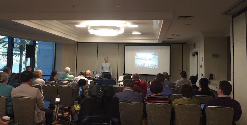
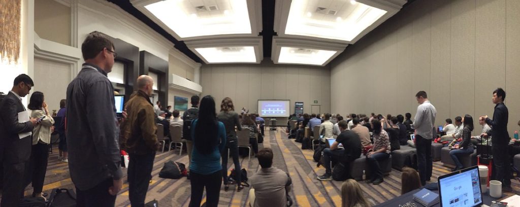
The inaugural Accessibility Toronto Conference was a big success! The event was held September 28-29, 2017 in the TELUS building in downtown Toronto. (Toronto has been a leader in conducting accessibility “camps” but this was the first “conference”.) Major thanks to the event organizers and sponsors.

Addendum Nov 6, 2017: AMI Inside: a11yTO Conference (YouTube)
Presentation Resources
Here are resources for many of the presentations. Feel free to add any to the comments.
- Designing Accessible Web Content for “Older” Users (ZIP of PDF) by Makoto Ueki @mak_en
- How do you get this damn thing to stop talking?!: Web accessibility testing (when it’s only part of your job) by Philip Springall @pipstopher
- Writing for Every Reader (Slideshare) by Stephanie Hobson @stephaniehobson
- In Defense of Native Form Validation Slides | Demo by Paul Grenier @AutoSponge
- Progressive Enhancement and Accessibility (PowerPoint) by Dennis Lembree @dennisl
- Everything I Know About Accessibility I Learned from Stack Overflow by Adrian Roselli @aardrian
- Calvin and Hobbes on Accessibility by @LeonieWatson
- Accessibility: No rights without responsibility by Nicolas Steenhout @vavroom
- Rethinking web accessibility on Windows by Marco Zehe @MarcoInEnglish
- Accessibility and Inclusion Beyond the Screen (Slideshare) by Linn Vizard
- No rights without responsibility by Nicolas Steenhout @vavroom
Notes
- The 7th #a11yTOCamp is scheduled for November 18 at @OCAD. Follow @a11yTO for more info.
- Great moment: Makoto strips off his flannel shirt and proudly displays a Toronto Blue Jays baseball jersey which was hidden underneath!
- Personally, it was great meeting some folks in person for the first time whom I’ve know online for years, especially @vavroom. Also met some great new folks!
- I also really enjoyed visiting Toronto—a very clean, fun, friendly, and diverse city!
Below are some selected tweets from the conference. The event’s account is @a11yTO and the hash tag is #a11yTOConf.
.@LeonieWatson and @thebillygregory kicking off #a11yTOConf pic.twitter.com/1REL3tgYK5
— Dennis Lembrée (@dennisl) September 28, 2017
Live ASL and CART at #a11yTOConf, this is what inclusion is all about. pic.twitter.com/6UDzueybQJ
— Toufic Sbeiti (@TouficSbeiti) September 28, 2017
https://twitter.com/aardrian/status/913434555410939910
"People try to answer ARIA questions, but they don't quite know what they're doing." Need to share more and educate! @aardrian #a11yTOConf
— Scott Vinkle (@svinkle) September 29, 2017
https://twitter.com/jiwon_bang/status/913857498045669387
"Accessibility is like ice cream—the longer you ignore it, the messier it gets." ~ @pipstopher #a11yTOConf #a11y
— Dennis Lembrée (@dennisl) September 29, 2017
Learning how @eBay does #a11y from @garcialo – check out the OATMEAL documentation! https://t.co/U20HwRGVl3 #a11yTOConf pic.twitter.com/IbHsafw61P
— Kalamuna (@kalamuna) September 28, 2017
In a recent survey, 3.4% of Stack Overflow users identified as having a disability ~ @Aardrian #A11yToConf
— TPGi (@TPGinteractive) September 29, 2017
https://twitter.com/vavroom/status/913794060288225280
https://twitter.com/AidanA11y/status/913476868606763009
"Automated testing is _not_ a substitute for manual testing." @rydbergk #a11yTOConf
— Scott Vinkle (@svinkle) September 29, 2017
Great #a11y writing tips from @stephaniehobson – consider cognitive disabilities by focusing on the functional effects. #A11yToConf pic.twitter.com/9vDlkGgXyd
— Kalamuna (@kalamuna) September 28, 2017
https://twitter.com/vavroom/status/913405306603999232


