Categories
html5 screenreader testing

Strikethrough Accessibility

Strikethrough <s> is an HTML element to indicate text that is crossed out – usually indicated visually with a line through the middle of the text. The W3C definition is:

The s element represents contents that are no longer accurate or no longer relevant.

On e-commerce websites, a strikethrough element is often used to indicate a price is no longer valid and often has a reduced price next to it.

Screenshot of two similar examples of a product with an active and crossed out price. A red arrow points to each of the crossed out prices.

The problem is that most screen readers don’t output the strikethrough semantics. This can be very problematic to the blind user since they won’t know which price is valid. Most in-line semantic elements such as <em> and <mark> are not conveyed to screen readers actually. For more on that, reference the article Screen Readers support for text level HTML semantics by TPGi.

Let’s examine four test cases and the level of support. Note that the strikethrough element is mapped to the deletion ARIA role which we’ll use in test Scenario 2.

Test Cases

Four code scenarios were tested against 6 screen reader/browser/OS combinations including VoiceOver, NVDA, JAWS, and TalkBack. The actual test cases used are in the second portion of the CodePen Negative number and strikethru tests.

Scenario 1: strikethrough element only

Price: $200 $100

Price: <s>$200</s> $100

The plain old semantic HTML—an S element around the text. This is obviously the ideal code, but support isn’t quite there yet. Only NVDA and TalkBack passed.

Scenario 2: strikethrough with ARIA ‘deletion’ role

Price: $200 $100

Price: <s role="deletion">$200</s> $100

This is similar to Scenario 1, but with the addition of role=”deletion”. The test results were similar to without the role. The only difference is that VoiceOver on iOS also passed.

Scenario 3: strikethrough with visually hidden text

Price: original price$200 sale price$100

Price: <span class="visually-hidden">original price</span><s>$200</s> <span class="visually-hidden">sale price</span>$100

This test case uses the old school technique of visually hiding text via CSS. “Original price” outputs before the price with the strikethrough, and “Sale price” outputs before the valid price.

All screen readers passed this scenario.

Scenario 4: strikethrough with visually hidden pseudo-content

Price: $200 $100

Price: <s>$200</s> $100

#pseudo s::before {
  content: " [start of stricken text] ";
}

#pseudo s::after {
  content: " [end stricken text] ";
}

#pseudo s::before,
#pseudo s::after {
  clip-path: inset(100%);
  clip: rect(1px, 1px, 1px, 1px);
  height: 1px;
  width: 1px;
  overflow: hidden;
  position: absolute;
  white-space: nowrap;
}

The fourth test case has the same HTML has Scenario 1. But then applies a brilliant method by Adrian Roselli introduced in 2017 in the article Tweaking Text Level Styles. Pseudo-content (creating a textual phrase via CSS) is used to indicate when the strikethrough starts and ends.

There are a couple issues to mention with this approach:

  1. Since NVDA now supports the strikethrough tag, it indicates the semantics twice — both the S element semantics (“deleted”) and the pseudo-content (“start of stricken text”) which creates ambiguity for the user.
    1. Oddly, the double semantics is not conveyed by TalkBack which did pass the previous three scenarios.
  2. With JAWS, the output is broken up with multiple stops which makes it difficult to follow. (Changing the brackets to parentheses might help.)

This technique technically works for all screen readers, but the user experience is very confusing for NVDA users.

Test Results

Does screen reader output “deleted”, “stricken”, or similar?

Test Results
iOS + Safari + VO MacOS + Safari + VO Android + Chrome + TalkBack Win + Chrome + NVDA Win + Firefox + NVDA Win + Chrome + JAWS
Scenario 1 No No Yes Yes Yes No
Scenario 2 Yes No Yes Yes Yes No
Scenario 3 Yes Yes Yes Yes Yes Yes
Scenario 4 Yes Yes Yes Yes Yes Yes

Conclusion

NVDA has the best support for <s>, the strikethrough element. For now, to best support screen readers overall, we should continue to use Scenario 3 — strikethrough with visually hidden text — to programmatically convey strikethrough semantics. Doing so will ensure that everyone understands strikethrough semantics while browsing the web which often means knowing the correct price of a product or service.

Further reading

Categories
html5 stats webaim

About the HTML Epidemic, WebAIM “Million” Report, and Teach Access

It’s been about a dozen years since I first realized that there is a world-wide HTML epidemic. Although I speak about the importance of semantic markup and tweet about it often, I wish I’d written specifically about it before. Thankfully others have such as Bruce Lawson, Manuel Matuzovic, and Laura Kalbag.

Web developers overwhelmingly fail when it comes to implementing semantic HTML, whether they actually know how to or not. There are many negative ramifications of this in the areas of device interoperability, reader modes, converting to PDF and EPUB formats, SEO, graceful degradation, code consistency/maintenance, and demonstrating professionalism. But particularly web accessibility.

WebAIM Million

Recently, WebAIM published a report analyzing the accessibility of the top one million website homepages in the world, called The WebAIM Million. This is striking empirical data on how poor accessibility is and how poor the quality of HTML is on the Web. For example, here are some figures from the study.

  • There was an average of 59.6 [accessibility] errors per page.
  • 97.8% of home pages had detectable WCAG 2 failures.
  • 5 of the top 6 issues were due to solely to improper HTML (missing alternative text for images, empty links, missing form input labels, missing document language, empty buttons).
  • 2,099,665 layout tables were detected compared to only 113,737 data tables (note that tables are for data, not layout).
  • On average, home pages had 36 distinct instances of text with insufficient contrast.

This is obviously bad. And, it’s important to point out that the study was done using an automated tool, which is capable of detecting only a portion of actual accessibility issues/errors. I estimate that the amount of issues would at least double or even triple if full audits were done.

Also, as a result of web developers’ poor HTML implementation, accessibility consultants are increasingly required to teach HTML to web developers rather than address “actual” accessibility issues.

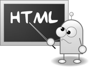
illustration of the letters HTML written on a chalkboard with confused cartoon-like character pointing to it

Resolving the HTML Epidemic

This is obviously a huge problem that must be addressed. What can we do to help resolve this HTML epidemic?

Digital accessibility must be considered when hiring and training employees. Accessibility must be considered when creating a web-based product. Accessibility must be a part of ongoing training for web professionals. Accessibility needs to be taught in education.

An organization called Teach Access (@teachaccess) is helping in some of these areas. Teach Access is a group of tech companies (including Apple, Google, LinkedIn, Adobe, and Microsoft) which is preparing designers, engineers and researchers to think and build inclusively. They have several initiatives including Faculty Grants and a web accessibility tutorial. And another way to fight the good fight for HTML semantics and accessibility is to become a member of Teach Access.

Teach Access is in partnership with PEAT (Partnership on Employment and Accessible Technology) which is a program funded by the Office of Disability Employment Policy, U.S. Department of Labor.

Teach Access logo

If you’re involved in education, please reach out to teachers and professors about Teach Access and about digital accessibility in general. HTML and web design are often part of computer science, software engineering, and mass media, advertising, and news programs. You can also offer to give a guest lecture.

If you have further ideas on how to improve the use of HTML semantics (and web accessibility), please leave in a comment on this post.

Directly Related Articles

More Related Articles

Related Tweets

Categories
html5 table

Clearing Up Summary

The summary attribute is a “classic” method to describe data tables to screen readers users. It’s mentioned in Section 508 and even in WCAG 2.0 technique H73. But this technique is outdated and I haven’t recommended its use for a while now.

Reasons not to use the summary attribute

Why don’t I recommended its use? Here are some reasons:

  • Many web editors don’t support it.
  • Because it’s not visual, the content can be easily be forgotten and therefore outdated/irrelevant.
  • Screen readers can automatically tell the user how many rows and columns a data table has so summary isn’t needed for this.
  • It’s deprecated in HTML5.
  • There is an ARIA alternative.

Misinformation

In the past, two web professionals, supposedly knowledgeable in accessibility, thought that the HTML5 Summary element (together with the Details element) can be used in place of the summary attribute. This is wrong. The Details/Summary elements are not related to the summary attribute and data tables.

And if you’re wondering, the Details/Summary elements are HTML5’s solution to toggle functionality. Browser support for Details/Summary is not quite there yet.

The ARIA Alternative

A description of a data table isn’t needed (and therefore a summary attribute) if the table is simple and clear (one header level, succinct header text, caption provided, etc.). If a description is needed, the text should be placed in the main content itself. This text can then also be associated to the table with ARIA.

In the HTML 5.1 Nightly, you’ll see the ARIA technique, 4.9.1.1 Techniques for describing tables. (Also in HTML5 technique 4.9.1.1) This is the proper way to use ARIA in place of the summary attribute to describe a data table.

Addendum: Thanks to @DBoudreau for pointing out the the tabindex=0 is required at this time for this to work properly for all screen readers.

<p id="tblDesc">The following table displays student population data of Foobar High School between 2003 and 2011 as computed by the XYZ Corporation.</p>
<table aria-describedby="tblDesc" tabindex="0">
 <caption>Student Population of Foobar</caption>
 <thead>
  <tr>
   <th>Year</th>
   <th>Population</th>
   <th>Change</th>
  </tr>
 </thead>
 <tbody>
  <tr>
   <td>2003</td>
   <td>846</td>
   <td>-3</td>
  <tr>
   <td>2004</td>
   <td>855</td>
   <td>+9</td>
  </tr>
 </tbody>
</table>
Categories
html5 video

Vimeo Updates Video Player Including Accessibility

Vimeo, a YouTube competitor, has recently updated its web-based video player. Vimeo now defaults to an HTML5-based player rather than Flash. It provides much faster playback/load times and improved tools to share a video.

Vimeo logo

Although the accessibility implementation may not be perfect, it’s a very significant improvement. The Vimeo player now supports keyboard and screen reader users and supports captions and subtitles! Here’s a live example of Vimeo captions by Amara (@AmaraSubs).

Thanks to Vimeo for these changes. We hope to hear about more improvements.

Further reading:

Categories
firefox html5 longdesc

Longdesc Links, History, Future

Recently I Twittered daily about longdesc, the classic unsung HTML attribute which supports long descriptions of images. Here’s a summary of the tweets/links:

Some History

To make a long story short (pun intended), longdesc was made obsolete in HTML5 but then returned. I applaud @JohnFoliot, @Laura_Carlson, and @Chaals in their dedicated efforts to return longdesc. I agree it should remain as there is no sufficient ARIA replacement.

Here are more great links on the topic on long description over the last few years.

The Future

Check out the ARIA 1.1 spec for aria-describedat ARIA 1.1 spec for aria-describedat! The aria-describedby attribute is like a combination of longdesc and aria-describedby. I’m pretty excited about this as it seems to provide a method for long description that we can all agree on.