Dennis and Ross provide nearly an hour of news, knowledge, and fun!
![]() Download Web Axe Episode 73 (Bandwidth & Download Time)
Download Web Axe Episode 73 (Bandwidth & Download Time)
Michigan and Web Dudes, Lab, and Accessible Twitter
- Dennis’ vacation including visit to Michigan
- Met creators of BongoTones
- Met creator of Twilk
- Visit to Yahoo! Accessibility Lab
- Accessible Twitter updates.
- Future of Skype
Web Accessibility News
- WebAIM – Colors and Links and WCAG 2.0
- ACCESS-IT 2009 Awards
- Nominations will be submitted online only.
- Submission deadline of nominations: 25th August 2009.
- CVS Accessible Web Site and Point of Sale (nice sub-heading).
- Misunderstanding Markup: XHTML 2/HTML 5 Comic Strip by Jeremy Keith @adactio.
- Accessible drag and drop using WAI-ARIA on Dev.Opera by Gez Lemon .
- Don’t Just Tick Boxes – Meeting the diverse needs of your site’s visitors is likely to mean a great deal more than ticking off individual accessibility checkpoints.
- AccessibilityWatch.com – fairly new accessibility blog (more than web).
Main Segment
The Issue & Statistics
- Web accessibility is about providing content for everyone; even if the user is unable to have access to a broadband internet connection.
- Economic issue; many people simply can’t afford broadband.
- Mobile–light and fast web sites can be more easily viewed on you phone!
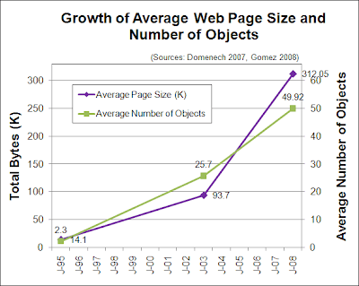
- Average Web Page Size Triples Since 2003 (study from 2003-2008 data)
- In the U.S. in March 2008, users connecting at 56Kbps or less now make up 11.18% of active Internet users.
- CWA Communications reported that the “median real-time download speed in the U.S. is a mere 2.3 megabits per second (mbps). The best available estimates show average download speeds in Japan of 63 mbps, in South Korea of 49 mbps and in France of 17 mbps.

Chart shows that from January 1995 to January 2008, there was a tremendous growth of average page size and average number of objects. The average page file size went from 14.1k in 1995, to 93.7k in 2003, to over 312k in 2008. The average number of page objects went from 2.3k in 1995, to 25.7 in 2003, to nearly 50 in 2008.
Related WCAG Guidelines
Content must be robust enough that it can be interpreted reliably by a wide variety of user agents, including assistive technologies.
WCAG 1.0 Intro states:
user may have a text-only screen, a small screen, or a slow Internet connection and users may have turned off support for images (e.g. due to a slow Internet connection)
Greatly outdated web portion of Section 508 doesn’t mention internet connection speed.
What You Can Do
- Use progressive enhancement.
- Optimize images; use sprites.
- Write clean code.
- Use external CSS and JavaScript files. For CSS, use not @import.
- Combine multiple CSS files into one. Same for JavaScript.
- Use media domains.
- Minify CSS and JS files.
- Setup your server to send pages and files compressed.
- Cache dynamic data and Ajax when appropriate.
More from the Big Boys
- More at Best Practices for Speeding Up Your Web Site from Yahoo!
- And now, Let’s make the web faster from Google, with fun little videos.
