Categories
"fixing alt" alt fun

Fixing Alt – How much caffeine?

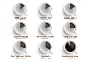
It’s been a while since we’ve added to our “Fixing Alt” series which provides alternative text missing from infographics. So I thought a recently published infographic, How much caffeine is actually in your coffee, would be perfect. The image tells how many milligrams are in a cup of coffee from a variety of brands/stores. The alternative text provided on the blog is the same as the title of the blog; the actual content in the image is missing; it’s not accessible.

caffeine infographic

This is a fun topic but also important as we coffee drinkers, sighted or not, should be aware of the figures (assuming they’re accurate). So below is the information in the image and what should be content on the original page or referenced with the longdesc attribute.


Caffeine infographic; 9 kinds of coffee, each with a coffee mug that displays an amount of coffee relative to the level of caffeine. Each amount below is in milligrams of caffeine per fluid ounce.

  1. McDonald’s: 9.1
  2. Seattle’s Best: 10.4
  3. Biggby Coffee: 12.5
  4. Dunkin’ Donuts: 12.7
  5. Dutch Bros. Coffee: 12.8
  6. Caribou Coffee: 15
  7. Peet’s: 16.7
  8. Starbucks: 20.6
  9. Deathwish coffee: 54.2
Categories
alt articles expert lists

Leave Accessibility to the Experts Please

There’s a fine line between inducing conversation and creating havoc. In the field of web accessibility (which is very complex and fragile already), it seems that this line has been crossed at least a couple times lately.

Recently, renowned CSS expert Chris Coyier (@chriscoyier) wrote the blog Navigation in Lists: To Be or Not To Be. The blog re-evaluates, again, whether lists (UL element) should still be used for navigation menus or just remove them and use only the remaining anchor text. Much unnecessary debate was generated from this. Most of it regarding use with screen readers, an area in which the author is not an expert.

The straight answer? Continue to use lists.

Just because one screen reader user gives an opinion, doesn’t mean that’s the way to go. Lists are beneficial in many ways: they’re semantic; they provide info to users of assistive technology; they provide hooks for developers to implement design and interaction; and it’s a convention.

A day after the Coyier blog, web standards guru Jeffrey Zeldman (@zeldman) on A List Apart published the blog titled on alt text about the use of the alt attribute and its impact on screen reader users. Topics in the comments include its use in HTML5, confusion with the title attribute, and using a space or not when empty value. This sparked a lengthy debate in the comments and on Twitter.

The straight answer? Use alt text; if an image is decoration then implement with CSS; if a decorative image is still inline or has no added value, use alt="", with no space. (Hint: repetitive content has no value.) If an image is linked, it must have alt text conveying the meaning of the link (and not necessarily the image itself).

Web celebs have created confusion when the answer was already agreed upon by most web accessibility professionals. So, I won’t write about NodeJS and Spring if you other experts stick with your area of expertise. Many times, we should leave accessibility to the experts. Agreed?

PS: I am indeed a fan of Coyier’s work and I greatly respect the invaluable foundation that Zeldman helped build for web standards.

Categories
"fixing alt" alt facebook fun

Fixing Alt – Facebook Like Button Explained

The next in our “Fixing Alt” series is the Facebook Like button explained posted on MakeUseOf a while back. It’s a short but sweet comedic image, but again, with no alternative text provided. So here it is.

Facebook Like button, equals: I’ve read it, but I’m too lazy to comment!

PS: There are so many other things wrong with the MakeUseOf web page. But since my New Year’s resolution is not to be as critical, I won’t go into it.

Categories
"fixing alt" alt

Fixing Alt – Netflix Comic

The Oatmeal does it again! A great comic with no alternative text. This time, it’s a on the recent Netflix pricing fiasco. The comic is called Why Netflix is splitting itself in two. So once again, here is the text for those who cannot access the image content:

Title: Why Netflix is splitting itself in two.

Image: Store front with store name “Netwiches”. Sign in left window says “Now streaming sandwiches 24 hours!”. Sign in right window says “Instant yum”.

Cashier: Hello, welcome to Netwiches. What would you like?

Customer: Hmm…could I get a coconut gravy frosted Netwich with extra cheese?

Cashier: Sure thing. That’ll be $15.98.

Customer: What? You raised your prices by 60%!

Cashier: No sir! We lowered our prices. See, if you buy just the bun, it’s only $7.99!

Customer: Why would I only want the bun? Can I speak to your manager?

Manager: Hello sir! I understand you’re unhappy with our price change. How can I help?

Customer: How about giving me my sandwich at the old price?

Manager: Sorry sir, I can’t do that. We’ve received a lot of complaints about our recent price change, however, so we intend to fix it. Come back later and we’ll have it all sorted out.

Later…

Cashier: Welcome back to Netwiches! What would you like?

Customer: Could I get a coconut gravy frosted Netwich with extra cheese?

Cashier: Sure thing! We listened to your feedback and we only sell buns now. If you want meat and condiments you have to go across the parking lot to another restaurant!

Customer: Wait, what? How does that fix anyth-

Cashier: It’s like an adventure! You get to walk across the parking lot! Why just the other day I saw an adorable little chipmunk eating some stale nachos. It was like dinner and a show! A nacho chipmunk show, ha ha! And no extra cost!

Customer: Can’t I just get my sandwich at the old pri-

Cashier: And look! Food from this other restaurant comes in the same red bag you know and love! Yay a plastic bag! Weeeeee!

Customer: Seriously? I’m about as attached to that bag as I am to your food after it comes out of my butt.

Cashier: Hey, where are you going? I’ve save the best for last. This new restaurant has an incredible Web 2.0 name that’s sure to blow your Web 1.0 mind right out the god damn window!

Image: Second store front. Sign in right window says “grand opening”. Store name is “Qwichster: the Friendster of Sandwich Restaurants!”
Categories
"fixing alt" alt fun

Fixing Alt – MacGuyver Coffeemaker

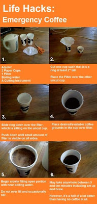
No coffeemaker and need coffee?! So you search the web and find an article about brewing coffee MacGuyver-style, but can’t access the large image which contains the vital points. Lifehacker’s article Brew an Emergency Cup of Coffee with Two Paper Cups and a Filter is practical and fun, but the image containing the crucial steps is missing alternative text. So to save my fellow coffee fans in a time of crisis, here’s the alt text:

  1. Acquire 2 paper cups, 1 filter, boiling water, a cutting instrument.
  2. Cut one cup towards the top so that it creates a ring at least 2 inches tall. Place the filter over the other uncut cup.
  3. Slide ring down over the filter, which is sitting on the uncut cup. Push down until small amount of filter is visible on all sides.
  4. Place desired/available coffee grounds in the cup over filter.
  5. Begin slowly filling open portion with near boiling water. Do not over fill and occasionally stir.
  6. Brewing may take anywhere between 5 and 10 minutes including set up and brew. However, it’s a hell of a lot better than having no coffee at all.
view full image