Categories
color css javascript podcast twitter wcag2 yahoo

Podcast #73: Bandwidth & Download Time

Dennis and Ross provide nearly an hour of news, knowledge, and fun!

Download Web Axe Episode 73 (Bandwidth & Download Time)

Michigan and Web Dudes, Lab, and Accessible Twitter

Web Accessibility News

Main Segment

The Issue & Statistics
  • Web accessibility is about providing content for everyone; even if the user is unable to have access to a broadband internet connection.
  • Economic issue; many people simply can’t afford broadband.
  • Mobile–light and fast web sites can be more easily viewed on you phone!
  • Average Web Page Size Triples Since 2003 (study from 2003-2008 data)
  • In the U.S. in March 2008, users connecting at 56Kbps or less now make up 11.18% of active Internet users.
  • CWA Communications reported that the “median real-time download speed in the U.S. is a mere 2.3 megabits per second (mbps). The best available estimates show average download speeds in Japan of 63 mbps, in South Korea of 49 mbps and in France of 17 mbps.

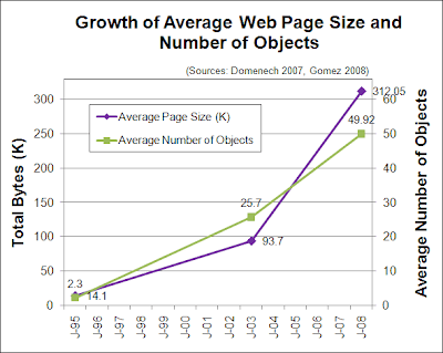
Growth of Average Web Page Size and Number of Objects

Chart shows that from January 1995 to January 2008, there was a tremendous growth of average page size and average number of objects. The average page file size went from 14.1k in 1995, to 93.7k in 2003, to over 312k in 2008. The average number of page objects went from 2.3k in 1995, to 25.7 in 2003, to nearly 50 in 2008.

Related WCAG Guidelines

WCAG 2.0 Principle 4: Robust

Content must be robust enough that it can be interpreted reliably by a wide variety of user agents, including assistive technologies.

WCAG 1.0 Intro states:

user may have a text-only screen, a small screen, or a slow Internet connection and users may have turned off support for images (e.g. due to a slow Internet connection)

Greatly outdated web portion of Section 508 doesn’t mention internet connection speed.

What You Can Do
  • Use progressive enhancement.
  • Optimize images; use sprites.
  • Write clean code.
  • Use external CSS and JavaScript files. For CSS, use not @import.
  • Combine multiple CSS files into one. Same for JavaScript.
  • Use media domains.
  • Minify CSS and JS files.
  • Setup your server to send pages and files compressed.
  • Cache dynamic data and Ajax when appropriate.
More from the Big Boys
Categories
law survey

SurveyMonkey – web accessible or not? NOT!

SurveyMonkey claims Section 508 compliance and web accessiblity, but that is false.

Accessibility Statement? No, but info about accessibility in Help Center.

Tweet from Jared Smith
Survey Monkey’s problem is labeling method. Labels repeat A LOT (up to 6 times!). Turns label of “1” into “one hundred eleven” or “eleven”.

Tweet from mr_beeps
I had assumed the accessibility statement was referring to *future* releases of survey monkey, not the current one!

Jared:
Despite what Survey Monkey claims, their forms are not very
accessible. They are technically accessible, but not very useful. I’d
maybe consider replacing the radio button options with select menus.
They just seem to me much easier for screen reader users in Survey
Monkey. The problem is that the label for each element is usually read
multiple times (sometime 6 times) because of the way it’s coded. Radio
buttons don’t use fieldset/legend, but the label for each item is
coded multiple ways. The grid of answers were particularly difficult
with JAWS repeating the label for each item over and over and over
again. Putting each in a select menu (“How would you rate Accessible
Twitter’s speed”) would be better.

And this actually causes other significant items. On the “How many
times” question, the labels are repeated multiple times, but JAWS
jumbles them together. The radio button labeled “1” is there two
times, JAWS actually reads “one hundred eleven” the first time it
reads it and “eleven” when you cycle back through the radio buttons.
“2-5” is read as “two dash fifty two, two dash fifty two, dash five”.
Spelling out the numbers would help… a bit, though it would then
read “two dash five two”.

SurveyGizmo
SurveyGizmo’s accessibility statement

Categories
conference event presentations twitter

Speaking on “Twitter and Web Accessibility” at AHG

Web Axe host Dennis Lembree will be speaking on “Twitter and Web Accessibility” at the 12th Annual Accessing Higher Ground conference in Colorado this mid-November.

The conference is November 10 thru 14. The labs are scheduled for a Tuesday and Wednesday, then the main conference is Thursday, Friday, and Saturday. (One day longer than last year!) Dennis is scheduled to speak on Thursday at 9:15am.

The keynote speaker is T.V. Raman, Research Scientist, Google, Inc. Dolphin Computer Access, LTD will sponsor one of the conference computer labs. They will also present 2 hand-on sessions on alternate format conversion.

The location of the conference is the Westin Hotel in Westminster, which is about 30 miles from the Denver International Airport (DEN). The hotel, or resort I should say, looks very nice!

You may register here. The shortened URL is tinyurl.com/ahg2009. Hope to see you there!

Categories
design html5 podcast twitter

Podcasts from Tweeps: Universal Design, SitePoint, Heretech

Some great recent podcasts from some great Tweeps (if you’ve been on Mars, that means users of Twitter).

Categories
"assistive technology" input mac testing yahoo

Visit to Yahoo! Accessibility Testing Lab

I was fortunate enough to get invited for a visit to Yahoo! Accessibility Testing Lab (in Sunnyvale, California). Victor Tsaran (@vick08) and Alan Brightman (@abrightman) were kind enough to spend about an hour and a half with me and several other computer professionals. Here are some notes from the meeting:

  • Learned a lot about Mac’s accessibility features. You can find them under under System Preferences/System/Universal Settings. Apparently they’ve been present since 1985, but most people don’t know they exist.
  • Apple computers come with a screen reader VoiceOver, which is now on the iPhone. On the Mac, it displays the text which it’s speaking; a great for blind person to work with a deaf person.
  • The demo of alternative input devices and software (including switch devices, head tracking, and an alternative keyboard) really creates awareness of others’ needs.
  • Saw a demo of a braille output device. It was noted that this type of device is best for the deaf-blind. They are very expensive, and more popular in Europe as there tends to be more subsidy.
  • Issues and features with mobile devices including screen magnifiers, speaking menus, camera-scanner-reader combo.
  • Some excellent links:

Victor, Rob and Alan in the lab