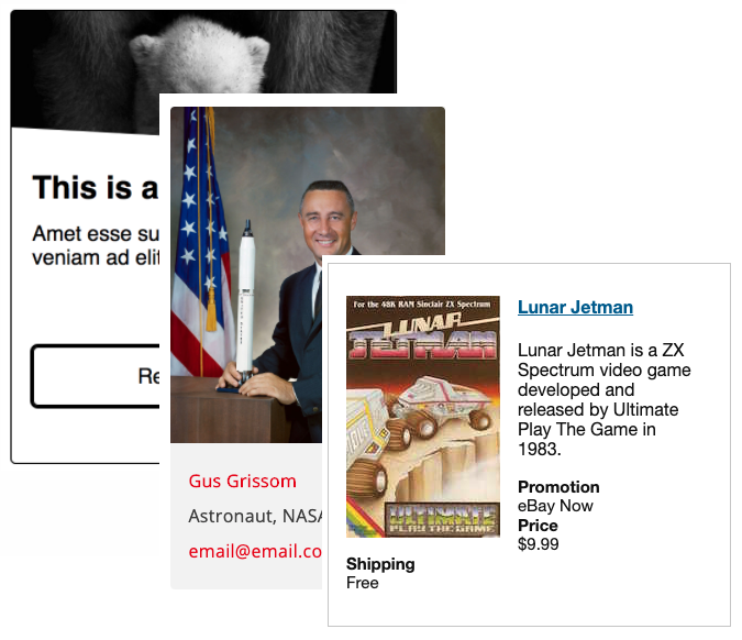
The card pattern (also know as tiles and blades) has become quite popular over the last several years. There are many accessibility challenges that may arise quickly when web developers attempt to build them including:
- Providing keyboard access
- Providing an adequate visible focus indicator
- Link text that’s not overly verbose for screen reader users
- Using correct semantic markup, especially for the heading
- Maintaining proper reading order
- Not duplicating content
- Making entire card a hit area for pointing devices
Here are a several great resources on building accessible cards/tiles and address these issues:
- Added 2023: Card Patterns by Vesa Piittinen
- Forked from Card Patterns by Rocío Alvarado
- Cards by Inclusive Components (2018)
- How to build accessible cards–block links by Nomensa (2020)
- Tile examples by eBay MIND Patterns (updated 2019)
- Cards by a11y Style Guide, Carie Fisher
- Cards with Delete example by Zoë Bijl
- Card example by Scott O’hara
- Cards by GEL BBC
- What makes an accessible card? presentation on YouTube by Rian Rietveld/Technica11y (2019)

