Categories
apple jobs

Accessibility Jobs, September 2013

Wow, great opportunities!

Categories
design fun youtube

Fun Web Accessibility Videos

Follow Harold in his quest to make an accessible website for his company Jiffy Brothers! This is an entertaining two-part video series about a fictional company and its website. It’s produced by The Human Resources Professionals Association (HRPA) of Ontario, Canada. Watch out for Boris!

Part 1 “Auditing Your Website for Accessibility”

Part 2 “Developing an Accessible Website”

You can find more information and videos from HRPA on the HRPA YouTube channel.

Categories
event mobile video

Accessibility Summit Quick Review

The Accessibility Summit, an online conference on accessibility, took place earlier this week. The event is presented by the good folks at Environments for Humans (@e4h). The event was one day in the past few years but was extended to two days this year! If you attended or not, take a look at the great information in the Twitter stream using the hash tag #a11ySummit.

Web Axe author Dennis Lembree spoke on usability and accessibility CSS gotchas. He will give a similar talk this fall at Accessing Higher Ground and CSS Developer Conference.

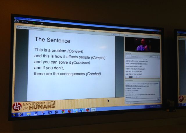
slide projected on wall
The sentence slide by Matt May.

Here are several great presentations which were given at the Accessibility Summit:

TalkBack & Magnification Accessibility in Android 4.3+ by Paul Adam (@PaulJAdam).

Keyboard and Interaction Accessibility Techniques (Slideshare) by Jared Smith (@jared_w_smith).

CHANGE is not a four-letter word (PDF) by Kimberly Blessing (@obiwanKimberly).

Accessible Video in The Enterprise (Slideshare) by John Foliot (@JohnFoliot).

A Web for Everyone: Accessibility as a design problem (Slideshare) by Whitney Quesenbery (@whitneyq)

Categories
aria design menu roundup

A11Y Roundup, Summer 2013

Here are some great links from this past summer. Enjoy!

Categories
"fixing alt" alt fun

Fixing Alt – How much caffeine?

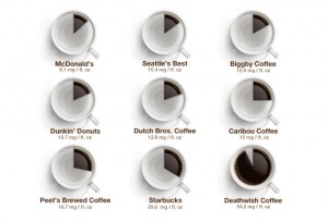
It’s been a while since we’ve added to our “Fixing Alt” series which provides alternative text missing from infographics. So I thought a recently published infographic, How much caffeine is actually in your coffee, would be perfect. The image tells how many milligrams are in a cup of coffee from a variety of brands/stores. The alternative text provided on the blog is the same as the title of the blog; the actual content in the image is missing; it’s not accessible.
caffeine infographic

This is a fun topic but also important as we coffee drinkers, sighted or not, should be aware of the figures (assuming they’re accurate). So below is the information in the image and what should be content on the original page or referenced with the longdesc attribute.


Caffeine infographic; 9 kinds of coffee, each with a coffee mug that displays an amount of coffee relative to the level of caffeine. Each amount below is in milligrams of caffeine per fluid ounce.

  1. McDonald’s: 9.1
  2. Seattle’s Best: 10.4
  3. Biggby Coffee: 12.5
  4. Dunkin’ Donuts: 12.7
  5. Dutch Bros. Coffee: 12.8
  6. Caribou Coffee: 15
  7. Peet’s: 16.7
  8. Starbucks: 20.6
  9. Deathwish coffee: 54.2